The setup managing millions of employees’ time off required a support call to configure
56%
Reduction in support tickets
21%
Fewer configuration errors
15hrs
Saved weekly per specialist
Screens have been debranded due to company policy
56%
Reduction in support tickets
21%
Fewer config errors
15hrs
Saved weekly per specialist
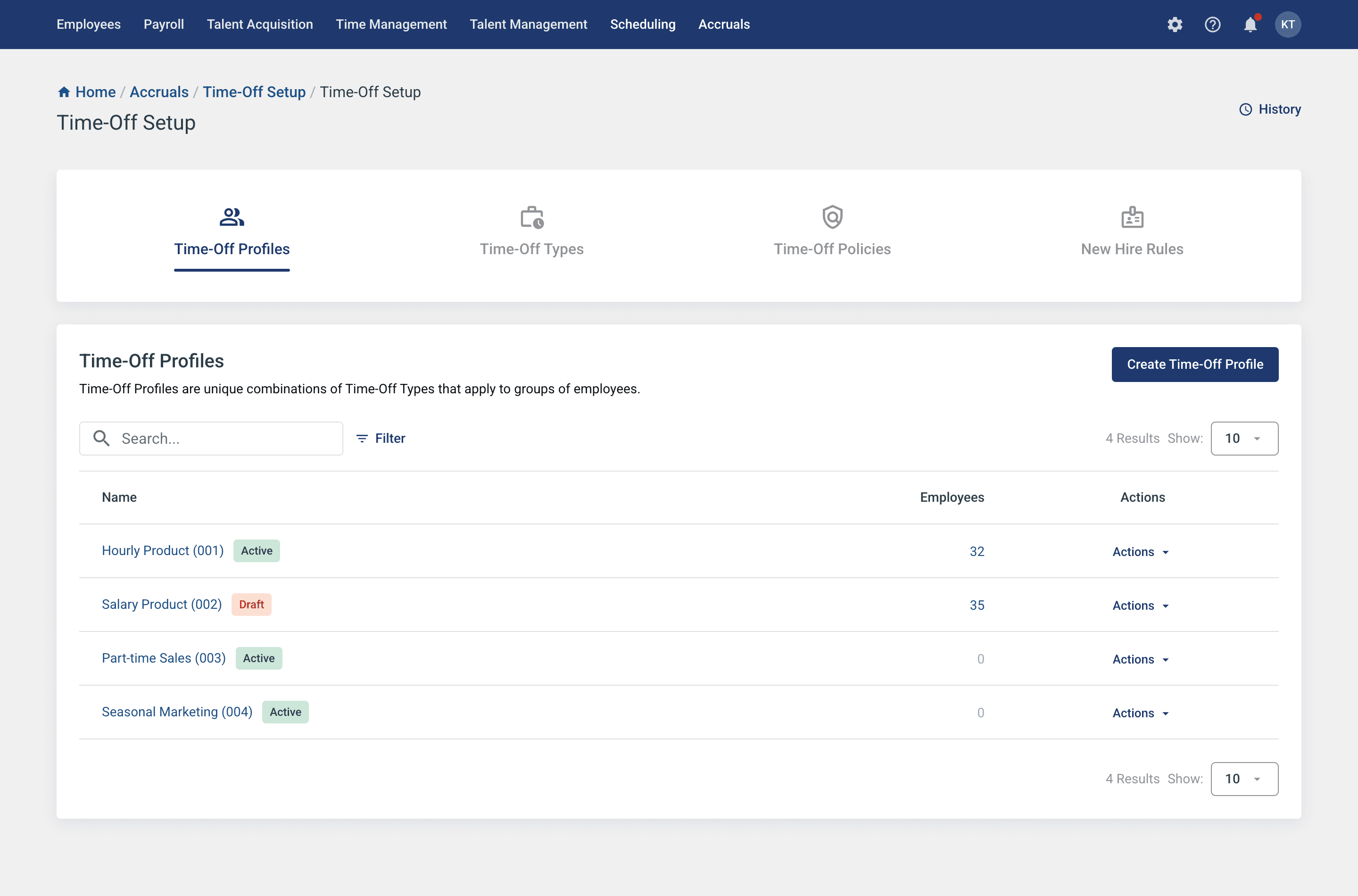
Redesigning accruals setup from an internal tool to a client facing solution
Role
Product Designer
Scope
XL Project
Team
2 Designers · 1 PM
Timeline
3 Months
Context
We were about to hand a tool that required weeks of training to clients who had none
Our company’s accrual system governed how every employee earned and used time off. It processed rules for millions of employees, but the setup tool was so complex that even trained specialists kept physical reference binders at their desks. When leadership committed to opening it up to clients, we had to rethink the entire experience.
How might we make accrual setup simple and intuitive for clients without disrupting internal workflows?
Research
We interviewed 15 participants across departments
The same frustrations surfaced again and again
Unclear Navigation
Internal navigation workflows varied significantly, so the redesign needed to be flexible enough to support multiple approaches
We also ran 24 workshops and feedback sessions
with stakeholders
That collaboration shaped every decision that followed
Confusing and Overwhelming Setup
Turned a form into a guided conversation
What once required training manuals now clicked on the first try. Support tickets started dropping.
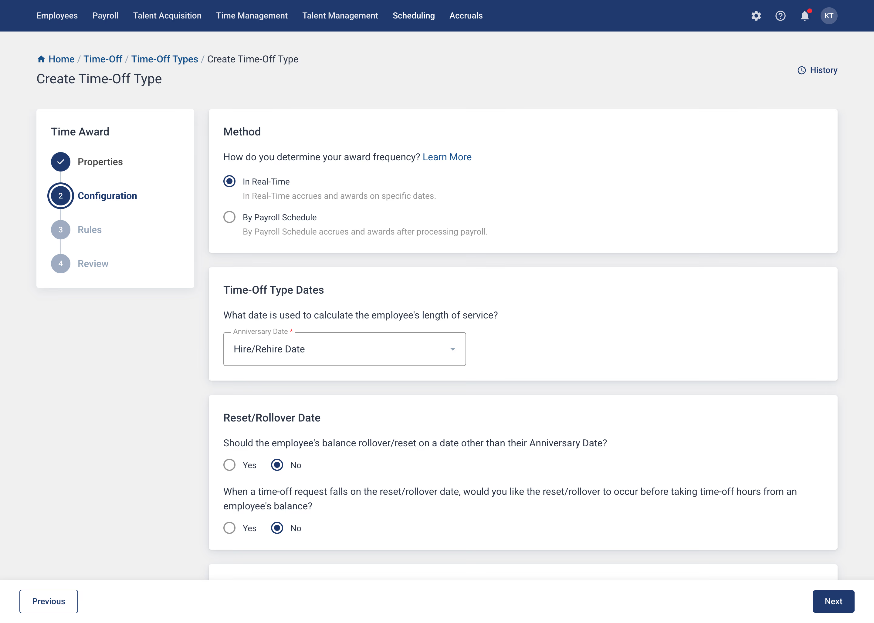
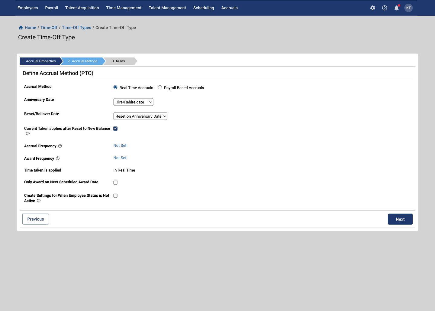
Lack of visibility into impact
Showed impact before anyone hit save
Edits went from guesswork to informed decisions. Configuration errors fell with it.
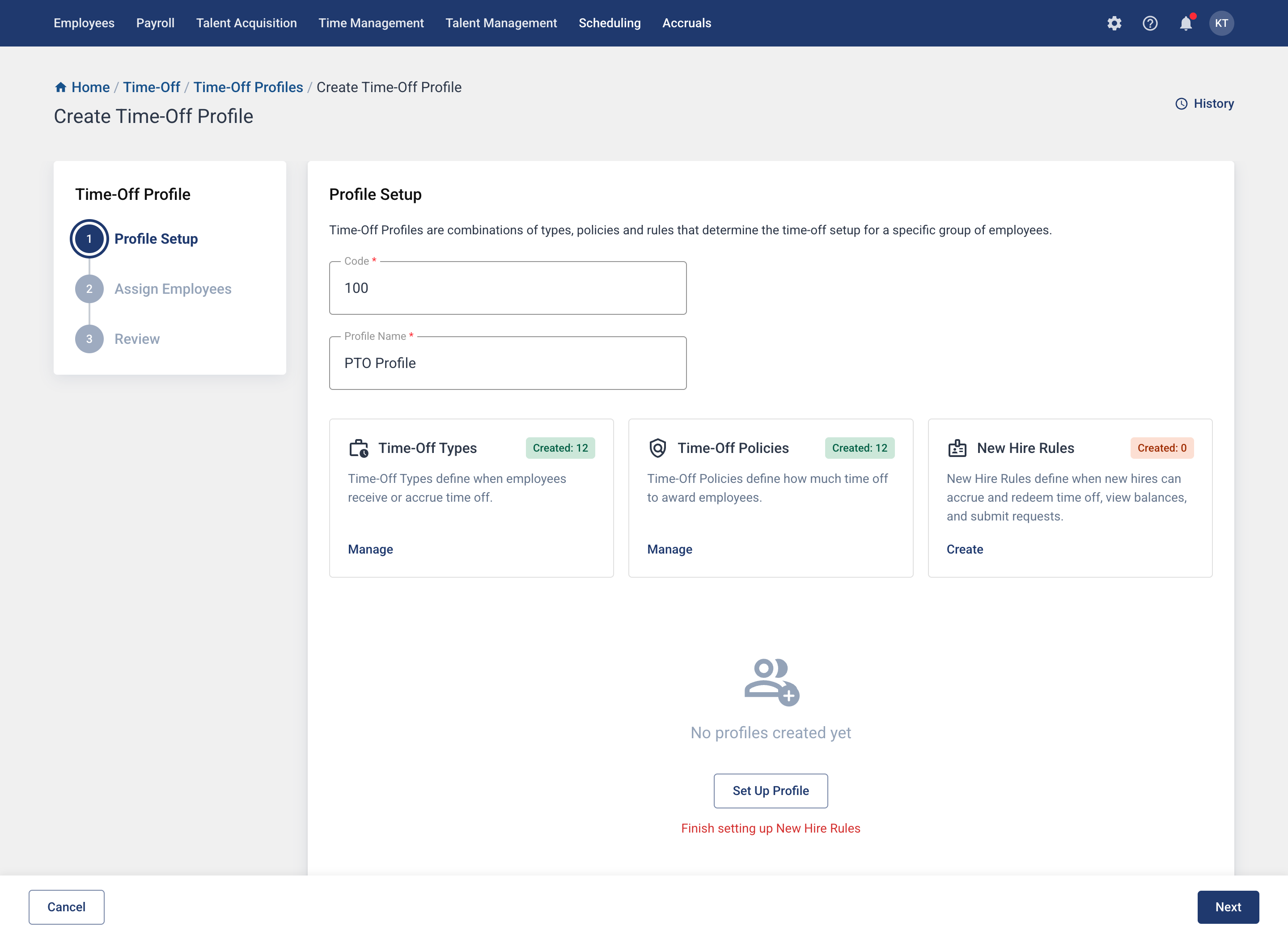
Unclear Navigation
Guided new clients without slowing down experts
Reflection
If I had more time, I would push the preview further
The real-time impact preview was the most validated feature in testing. I’d want to expand it across employee groups and show before/after comparisons, making every rule change feel safe, not just the first one.