Turned a finance tool nobody used into one managers rely on daily
Results
Reframed labor budgeting from a static finance tool into an operational tool managers could actually use.
38%
Reduction in setup time
43%
More weekly dashboard visits
15%
Increase in client adoption
0%
Reduction in setup time
0%
Increase in weekly dashboard visits
0%
Increase in client adoption
Based on Heap data from the first six months post-launch.
Problem
Client adoption was critically low. Managers weren't using the tool at all.
Our labor budgeting tool was built to help companies plan staffing spend and track labor against budget. Managers weren't completing setup, weren't using the dashboard, and were still scheduling shifts purely on gut feel, defeating the entire purpose of the feature.
Audit
Setup required too much effort before delivering any value
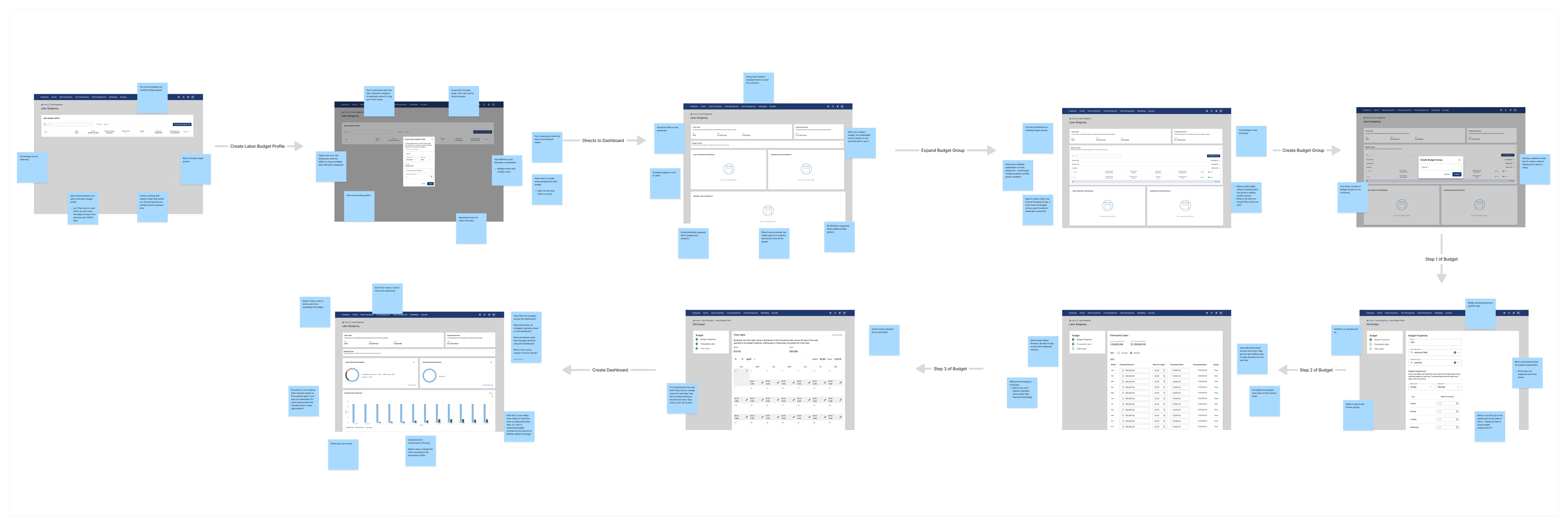
I audited the full setup flow with the PM. Managers had to fill in dozens of fields before they could even see a dashboard.
User Interviews
Managers told us directly that the tool wasn't built for them
Three friction points kept surfacing: too many inputs, unfamiliar terminology, and a dashboard that required leaving the scheduling view.
Affinity Mapping
Support tickets confirmed what we heard
After grouping every support ticket by theme, the picture became obvious. Setup was too complex, the dashboard wasn't answering real questions, and there was a huge disconnect between scheduling and budgeting.

Competitive Feature Matrix
The competitive gap showed us that budget visibility had to live inside scheduling
I benchmarked four competitors across the four features managers kept asking for. The result was clear. Budget-aware scheduling was standard everywhere but our product.
| Budget in scheduling | OT warnings | Actual vs. budgeted | Thresholds | |
|---|---|---|---|---|
 UKG UKG | ||||
 Workday Workday | ||||
 ADP ADP | ||||
 Ceridian Ceridian | ||||
 Our Company Our Company |
UKGWorkdayADPCeridianOur CompanyInsight
The problem wasn't a lack of need. The tool was just in the wrong place
Managers don't think about budgets and scheduling as separate tasks. The question they actually ask while building a schedule is: “Can I afford this shift?”
Setup
I aligned the tool with how managers actually think
I replaced finance jargon with plain operational terms, added contextual tooltips, and used progressive disclosure to make setup feel more guided.
What led to this
“It felt like it was built for someone in finance, not someone running a floor.”
I reduced input burden with AI-driven recommendations
Managers were overwhelmed by blank forms, but engineering flagged the inputs as necessary for edge cases. Instead of simplifying the system, I simplified the interaction with recommendations.
What went wrong
Testing showed that users didn't trust AI recommendations initially
How I solved it
Surfacing the source behind each recommendation, from historical data to labor patterns, earned user trust
I consolidated number of steps, cutting setup time by 38%
The old setup was 9 steps, with one asking users to manually enter each day. I added a rollover option so returning users could duplicate previous budgets instead of rebuilding from scratch.
Dashboard
Redesigned the dashboard which led to a 43% increase in visits
Only 8% of managers checked the dashboard weekly after setup. It showed data but didn't answer the questions managers actually had. The most requested feature, Actual vs. Scheduled vs. Budgeted comparison, didn't exist.
What went wrong
Testing showed that more data made the dashboard harder to use, not easier
How I solved it
After various iterations, came up with a dashboard focused around the questions that managers ask
Budget Integration with Scheduling
Putting budget visibility where shifts get built tied everything together
Managers ask “Can I afford this shift?” while scheduling, not in a separate budgeting tool. So I added a live budget rail to the scheduling view with warnings, and usage followed.
What led to this
“I'm not going to stop what I'm doing in the schedule to go check a separate screen.”
Reflection
What I learned from turning a failing feature around
Failed experiments are part of the design.
I couldn't remove inputs because of edge cases, AI lacked trust without transparency, and the first dashboard was too dense. Each failure clarified what users needed.
Put tools where decisions happen.
The biggest unlock was embedding budget data into the scheduling grid. Moving information to the point of decision changed usage more than any UI polish.