Created a Mobile-First Dashboard to Make Decisions on the Go
Scope
XL
Team
1 PM, 6 designers
Platform
Native iOS & Android
Reduced
support tickets
1st
Mobile-first dashboard platform-wide, setting the foundation for future dashboards
Problem
Critical tasks took too many steps to complete
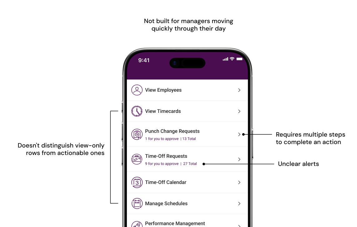
Most of our managers were running retail stores and restaurants, on their feet all day, rarely near a desk. Managers got notifications and emails about pending actions, but had to hunt through 4 to 5 steps just to find where those actions actually lived, which led to delayed approvals and frustrated employees.
Research
Card sorting and internal prototype testing shaped navigation and information structure
We used a mix of card sorting and internal prototype testing to understand how managers organize and prioritize information and navigate tasks.
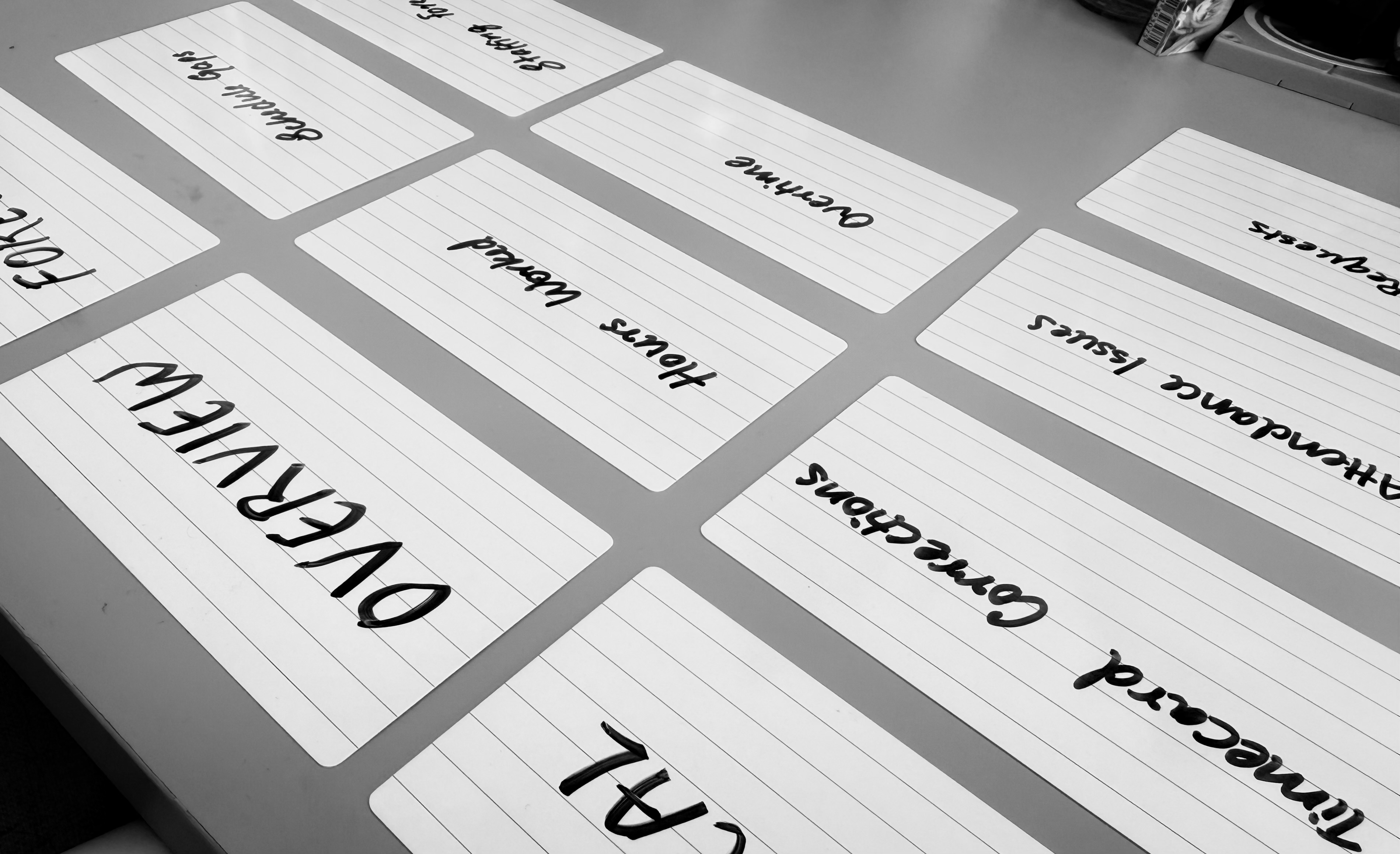
Ran card sorting sessions with 3 internal managers to validate how widgets should be grouped and prioritized
Navigation Decision
Created a more guided experience through tab-based navigation
Product initially favored a single scrollable dashboard because it minimized taps. But we believed that if every card competed for attention, managers would spend more time scanning than acting.
To validate the tradeoff, we prototyped both versions and tested them with internal managers. In the single-scroll design, managers repeatedly scrolled past information and struggled to relocate what they'd seen moments earlier. The tabbed version helped them quickly understand where to go based on what they needed to accomplish.
Organization Decision
Reduced cognitive load through simple and organized widgets
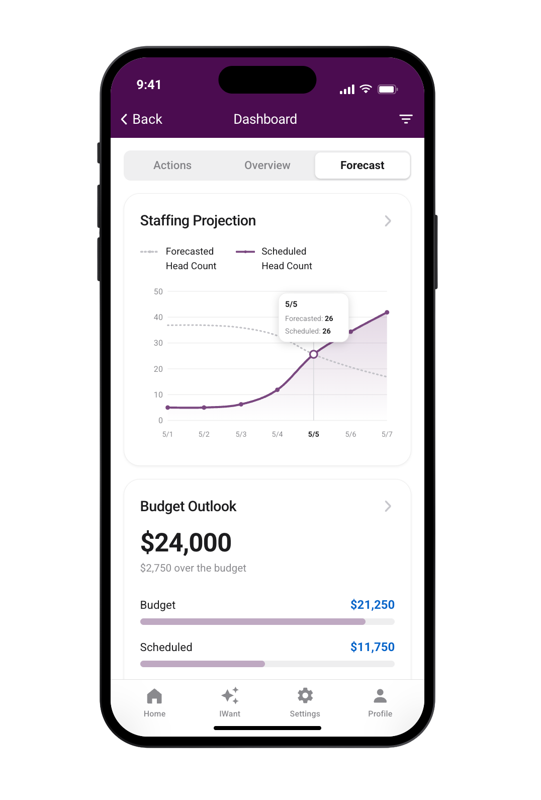
With limited mobile screen space, we capped each screen at three widgets to avoid overwhelming users. The card sorting we ran helped validate how managers expected information to be organized.
We also simplified charts to make it mobile-friendly and emphasized the most important metrics so information could be understood at a glance.
Interaction Pattern Decision
Eliminated unnecessary taps through interaction patterns
Rather than opening each request, we introduced consistent swipe actions for common tasks like Approve and Deny. This allowed routine decisions to happen directly from the list while keeping detailed views available when additional context was needed.
Standardized this pattern across all the list items
Prioritization Decision
Improved approval flow by prioritizing urgency over recency
We debated whether lists should display the newest items first or prioritize the most time-sensitive work. Card sorting sessions validated urgency-based prioritization. Managers needed to see time-sensitive items first because many decisions directly affected current or upcoming shifts and payroll processing.
Reflection
My next steps would be to
Validate across industries
Internal testing validated our direction, but our participants didn't represent every type of manager. Retail, hospitality, and healthcare would have different priorities, and testing across those environments would help uncover industry-specific needs.
Design for widget customization in v2
To meet our release timeline, we shipped a curated dashboard in v1. In v2, I would explore allowing managers to customize which widgets appear and how they're arranged, creating a dashboard that adapts to different roles and daily priorities.